LdoD Archive
Digital branding for the LdoD Archive, an online platform designed to experience one of the most complex books of Fernando Pessoa’s work: the Book of Disquiet
↳ Client:
Faculty of Arts and Humanities, University of Coimbra, Portugal 🇵🇹
↯ Sector:
Arts & Culture
— Scope of work:
Brand identity
Website design
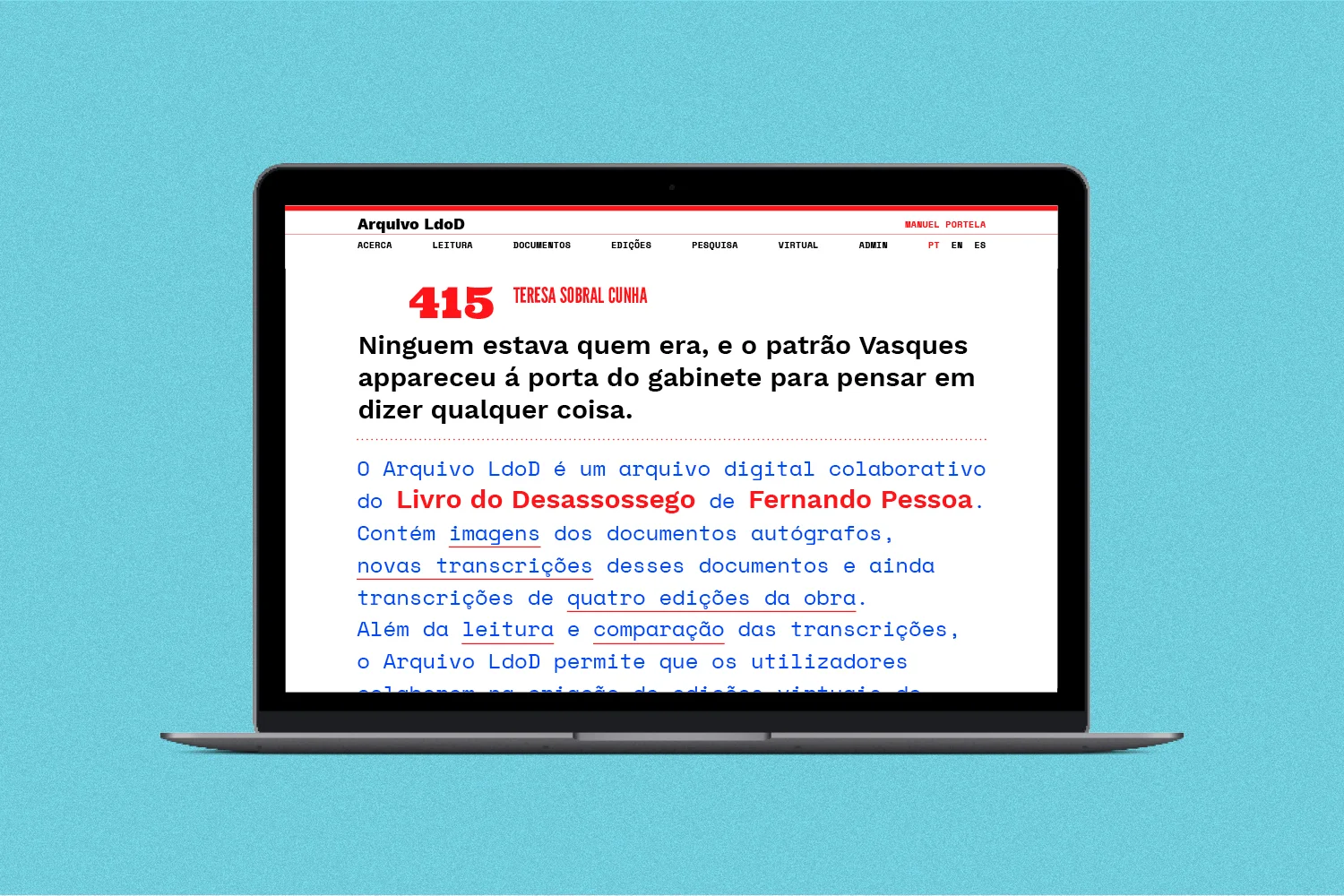
The LdoD Archive is a collaborative digital archive of the Book of Disquiet by Fernando Pessoa. It contains images of the autograph documents, new transcriptions of those documents and also transcriptions of four editions of the work. In addition to reading and comparing transcriptions, the LdoD Archive enables users to collaborate in creating virtual editions of the Book of Disquiet.
We designed the digital branding for this platform, transporting the flexibility of Pessoa’s work to the web. The Book of Disquiet is deeply connected with its material and papery manifestation, as it was written on a typewriter, on the back of calendars, covers, illustrations and tables, among others. We wanted to expand that graphic exuberance with our design project. This new platform enables infinite combinations of the fragments in which the book consists, so our response was a dynamic visual grammar based on the cornerstones of the book: language & typography.
We created a typographic ensamble consisting of a few typeface styles: Grotesque, Art Deco, Monospaced, Didone, Serifed, Egyptian, Condensed and Geometric. This specimens correctly encapsulate the typographic fauna of the 80’s in Portugal found in common printed matter. Following the scope of the LdoD Archive, all the selected typefaces are open source.
The brand identity is assembled with the combination of this different fonts, creating a dynamic language that evokes the old transcripts in which the Book of Disquiet is written. The color palette is also deeply connected with the original book: we used blue and red – just as in Fernando Pessoa's typewriter writings. Assuming that the book lies no longer on paper and lives now on the screen, we adjusted the contrast of these colors so that they didn’t look muted on the digital platform.
We designed the visual experience of the LdoD Archive so that each visit feels different, as the elements are randomly rearranged following a set of rules combining typefaces and graphic elements. This way, we keep the Book of Disquiet just as it is supposed to be: open, dynamic and fresh!


