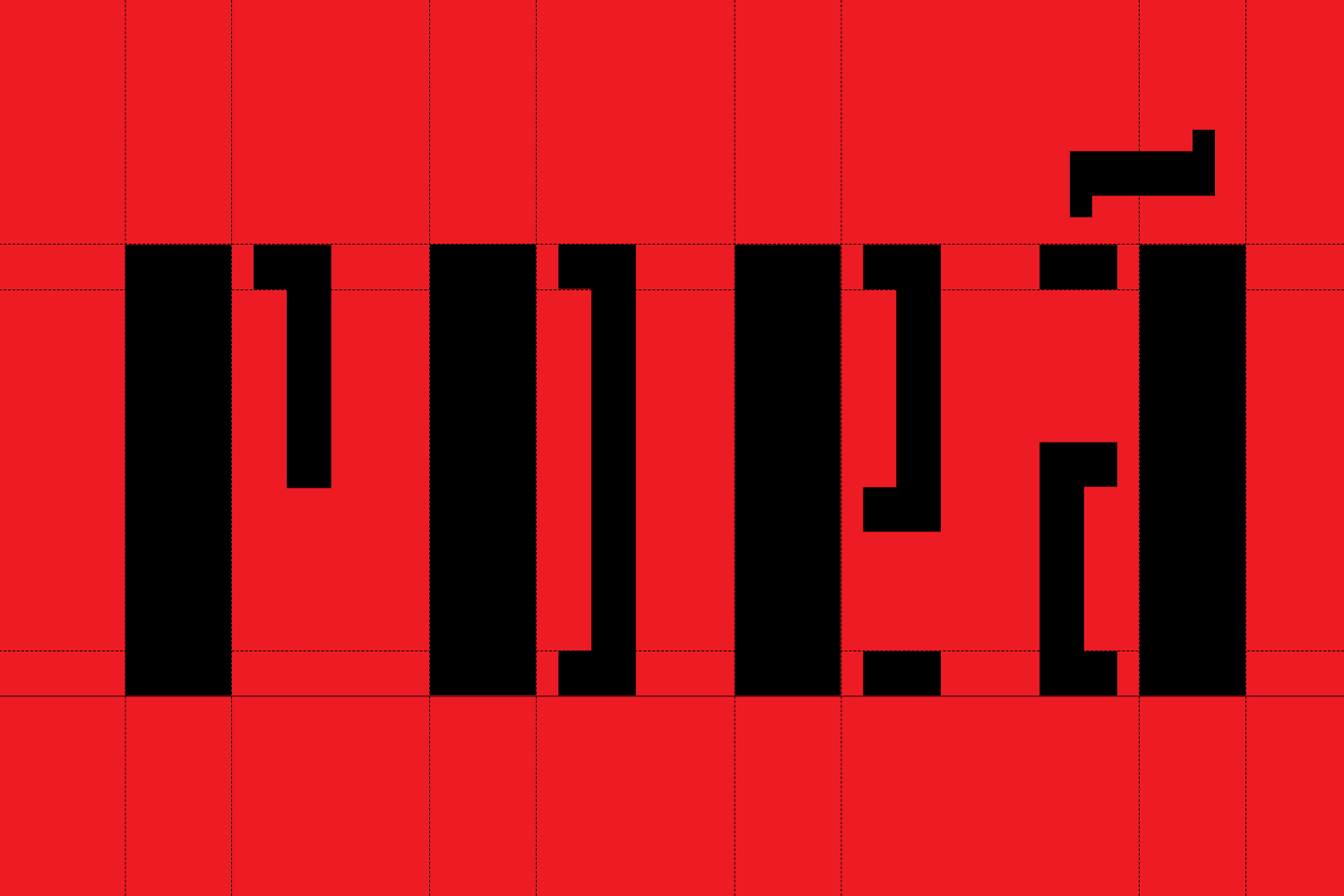
Rrevolução!
Brand identity design for a cultural event spanning across a series of exhibitions and publications about the Revolution of October 1917 that launched Russia on the path of modernity.
↳ Client:
College of the Arts, University of Coimbra, Coimbra, Portugal 🇵🇹
↯ Sector:
Arts & Culture
— Scope of work:
Exhibition identity
Type design
Editorial
Campaign
We designed a visual identity that leverages on the name given to the exhibition by the curators: "Rrevolution!" with two "R's". This duplicity of meaning is accentuated by the design of two distinct types of letters: one for the initial "R" and the final exclamation mark ("!"), and another for the word "revolution" itself.
The initial "R" and the final "!" evoke the purity of the geometric elements (based on the square, circle and triangle) related to modernist Russian aesthetics. On the other hand, the word "revolution" – which appears in the middle of the wordmark – evokes the revolutionary context with the use of stencil letters.


