Catavino
Brand identity for a luxury travel, food and wine specialist
↳ Client:
Catavino, Porto, Portugal 🇵🇹
↯ Sector:
Tourism + Food & Drink
— Scope of work:
Rebrand & Identity
Identity application
Visual positioning
Website


Catavino prides itself on designing highly customized experiences throughout Spain and Portugal since 2005. Ranging from jaw-dropping culinary experiences to simple off-the-beaten-track adventure stories in tiny Spanish towns, there’s a few elements that have always remained consistent at Catavino’s core: outstanding food, wine and cultural stories.
We approached Catavino with a brand architecture project, creating Catavino Tours (Custom luxury experiences crafted by food, wine and travel connoisseurs) and Catavino Stories (Great online source of travel knowledge, guides and tips), as the company felt the need to expand and better convey their top-notch value proposition.
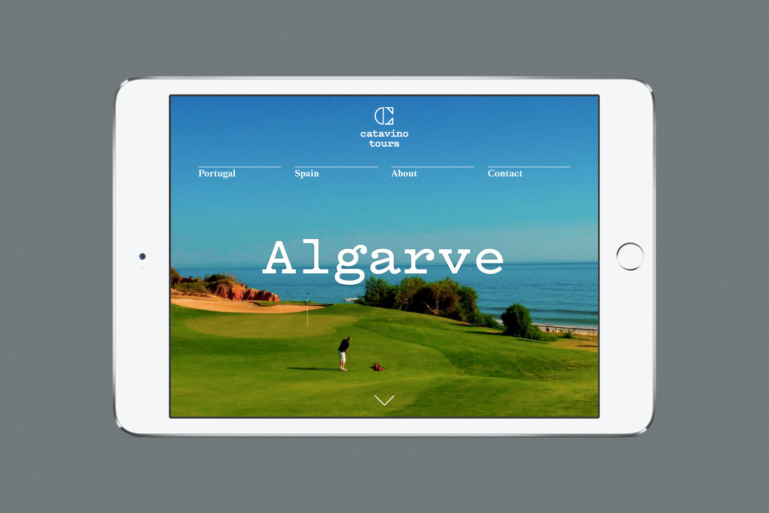


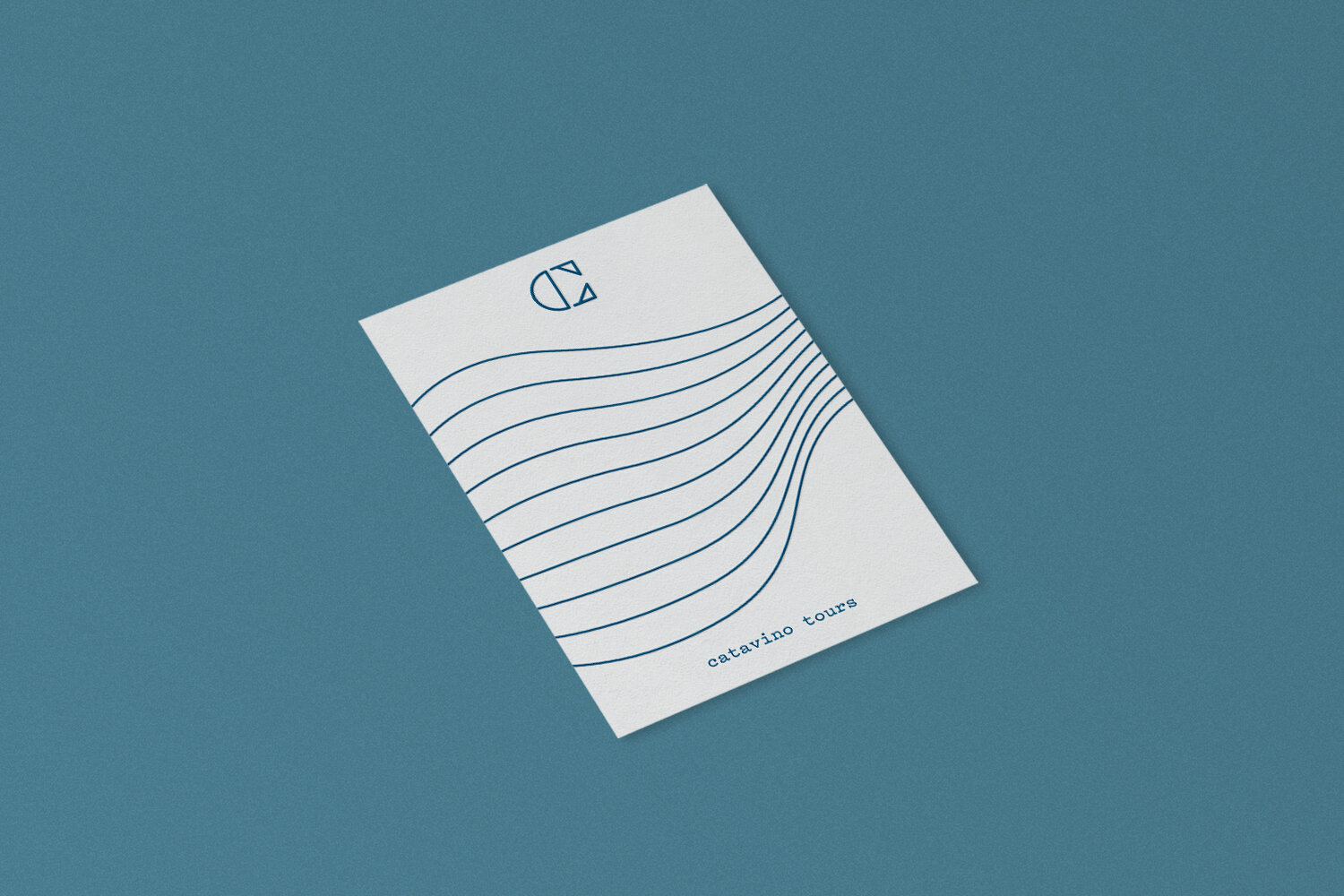
We reshaped the color palette in order to transmit the landscape characteristic in the Iberia; we simplified the naming output from CataVino to Catavino; and we created a typographic system based on culturally significant type families related to food and wine in both Portugal and Spain: a typewriter, a condensed and a serifed font — the combination of these three typefaces visually connects Catavino to its roots.


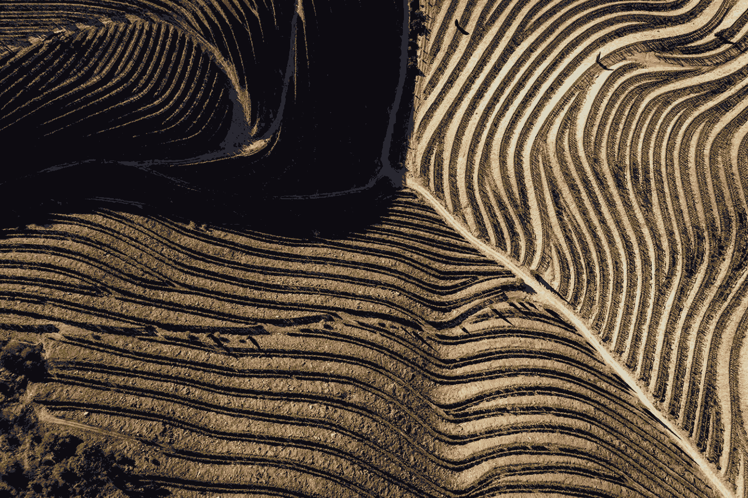
We designed a stencil uppercase C, inspired by wine crates and vernacular typography, that functions as the brand’s symbol. We also designed a dynamic visual grammar based on the terraces across the Douro River (an absolute best-of in the northern region of Portugal, where Catavino is based) that is used as a pattern across the overall branding.

