Arabian Housing & Building
Brand identity for AHB, a Saudi architecture & construction company
↳ Client: Arabian Housing & Building, Riyadh, Saudi Arabia 🇸🇦
↯ Sector: Architecture & Construction
— Scope of work:
Brand identity
Brand architecture
Communication assets
Identity application
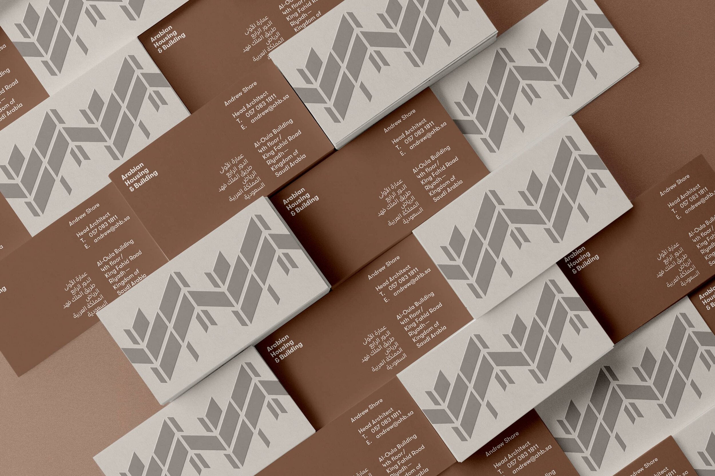
Arabian Housing & Building (AHB) is a major architecture and construction player in the Saudi market, known for its truly pure approach to architecture — making it neutral and simple. The point of AHB is to bring European standards of housing solutions to the Saudi market. We designed a visual identity that connects both ends of the spectrum: a pragmatic communication system that is at the same time culturally influenced by its geography and heritage.
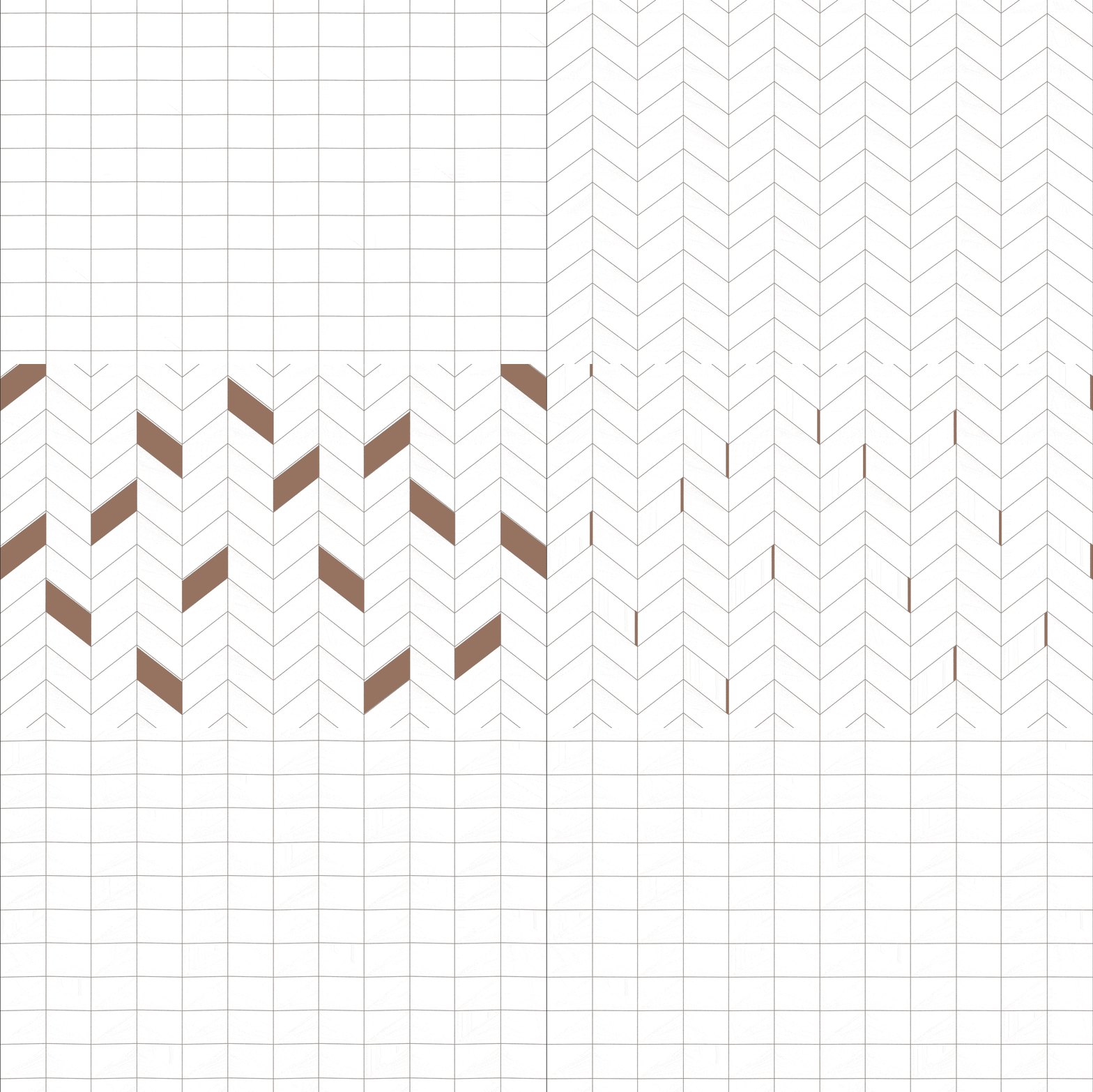
AHB is definite, decisive and blunt, so a Swiss sans serif typeface was rather effective transmitting their values visually. The color palette establishes a connection to the Saudi landscapes, but the core of the brand identity project lies in an essay by legendary architect Leslie Martin: “The Grid as Generator”.
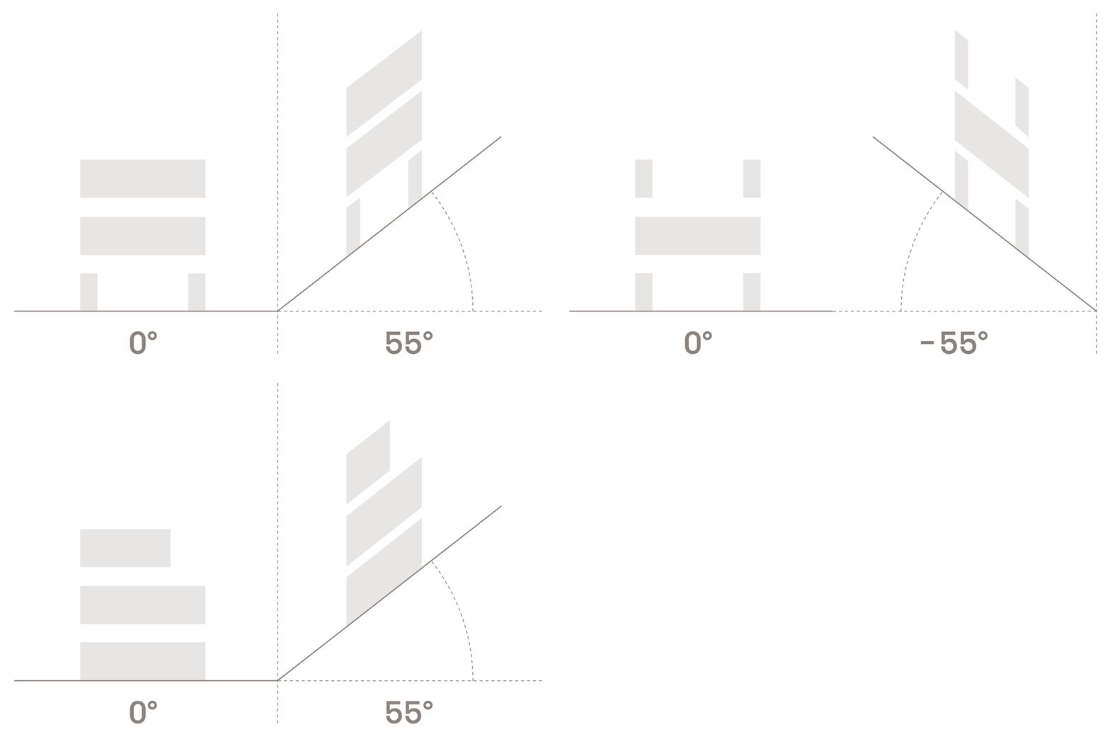
The visual identity of AHB is generated by a custom grid in which typography is constructed. This visual formula allows two different conceptual levels. First, the letterforms resemble Arabic scripts; Second, the angles of the grid transform the two-dimensional in the three-dimensional, providing volume to the logotype and echoing architecture and construction itself. We expanded this concept using the logotype as a pattern across many touchpoints of the branding.
The foundation of our work was a brand architecture project developed to link two sister companies: AHB (architecture and construction sector) and Axis (branding sector). Both companies are part of Taj Holding, and although each identity is completely different, they feel visually related.


